Role & responsibility
Timeframe
June 2026
TEAM
SKILLS
Motion design
Social ad creative
Brand adherence
Video editing
TOOLS
Overview
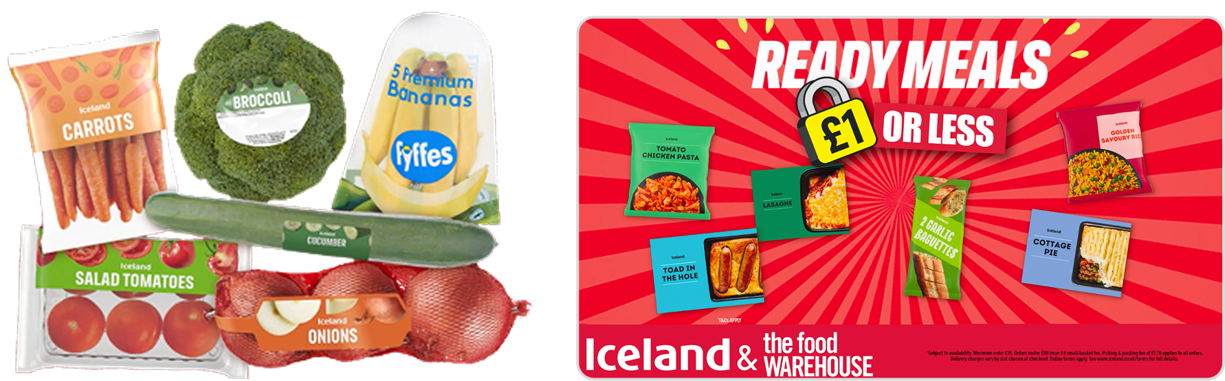
Collective Digital, a UK video production company, brought me in on a freelance basis to help create videos for their client Iceland Foods, and its sister brand The Food Warehouse. To mark 30 years of Iceland’s £1 ready meal range, around 750 products (ready meals, fruit & veg and household goods) were priced at £1 or less. The goal was to shout about it, getting more shoppers through the door and more traffic to the website.
The brief was one cohesive animated ad, delivered in multiple sizes across social placements. It had to stay true to Iceland’s brand (cheap and cheerful, inclusive, bold) and stand out in a crowded feed. It needed to be largely product-led, with fun animation that grabbed attention. Iceland already had static ads for this campaign that weren’t performing well, so my job was to create animated versions and see if they captured more focus.
Impact
The campaign pushed a measurable lift in site visits, supporting both the in-store and online goals.
One cohesive concept delivered in 9:16, 1:1 and 16:9 across Meta, TikTok and YouTube.
RESEARCH
With a client this well known, people notice instantly if something feels “off.” Iceland’s brand is bold, bright and approachable. Value is the USP, and it shows in a palette of primary colours, loud fonts and product-first visuals, often alongside happy shoppers.
The challenge wasn’t understanding the branding. It was translating it into motion: working out which elements should move, and how, while still feeling like Iceland.
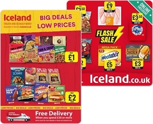
Like most of my projects, I started by looking at what others in the space were doing. I focused on low-price competitors like Aldi and Lidl, looking at both length and motion. Most of their videos ran 30 seconds or under, since the longer a video runs, the more chances someone has to scroll past.
Lidl had run a similar ad with food literally dancing. We had far more products to fit in, so we couldn’t take it as far, but a softer version, with each product moving subtly, felt like the right direction.
DESIGN DECISIONS
After the research I had a clear direction. The client wanted something simple and product-led, so the video would be bold text shouting about the sale, with animated products below.
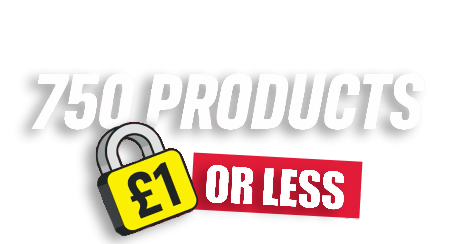
The client had supplied the overall messaging but no specific hook, and I wanted the first seconds to land without much reading. Instead of anything wordy, I led with the numbers. “750 products £1 or less” is only a few words, but it says exactly what the offer is. The only other text named the product types in the sale (ready meals, household and so on), so there were never more than 6 words on screen at once.
The video also needed a voiceover to give more detail on the sale. The client provided the script, and I needed a voice that fitted the bold, inclusive brand. To save time and budget, I browsed through voices on ElevenLabs and chose a young British female voice that sounded both excited and approachable. The client then approved it.
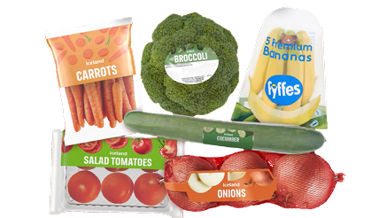
The client supplied around 18 hero product images – 6 main recognisable products to represent each category (household goods, ready meals, fruit and veg). The job was turning them into After Effects compositions and adding motion quickly and consistently.
With the structure set, I had to decide how the products should move within their category. After experimenting in After Effects, I settled on three animation styles, subtle enough not to distract from the message but lively enough to hold attention.
Each product arrived with its own wobble, a small rotation with a bounce and overshoot.
Every 3 seconds the products pulsed together (scaling up and down) to refresh attention.
A continuous, subtle up and down drift kept the products alive throughout.
ITERATIONS
With product animation decided, the next big creative challenge was balance. How many different things should move to grab attention without overwhelming people? That took three rounds.
To get the products moving as one, I first put the products from each category on a single layer and applied the three animations to that. It was the quickest route, but in testing it just looked clunky, like a sea of movement where no single product stood out.
Next, each product got its own layer with the same effects set at different timings. Only the pulse stayed in sync. This was far more interesting, especially over the background pattern, which had a gentle rotation.
I also added a 2-second intro clip before categories, showing the products one by one so each got a moment in the spotlight. I was happy with this level of movement, but ~30 seconds of the same visuals across three product categories felt repetitive and predictable. Collective Digital agreed and suggested breaking it up with further footage.
The final version added B-roll covering about a quarter of the ad. I collated supermarket stock footage (contactless payments, trolleys, happy shoppers, people eating, etc) and placed it between the product sections to give the eye a break from the grid.
I also tested a new animation here: products grouped in sixes sliding across the frame in unison, like a supermarket conveyor belt. It let me showcase a big range of products and echo Iceland’s fun branding without crowding the screen. Both Collective Digital and Iceland were happy with it.
CHALLENGES
With the direction of the ad settled, one of the biggest challenges was the formats. I started with the standard 16:9 frame, assuming it would be easy to shrink down for the more narrow formats. When I moved to 9:16, though, it looked odd and left a lot of vertical space. Some elements lost their punch and others needed rethinking entirely, so I ended up rearranging the products across the space, which was a slightly bigger job than expected.
The lesson: test composition in both extremes first, the narrowest and the widest frame, before animating anything.
Final Design
The final ad used text, products and background together, each with a different job:
The ad was then shipped in three formats:
OUTCOME
Click-through rate from social ads beat Iceland’s previous static versions of the same campaign.
More shoppers heading to Iceland’s website, supporting both the online and in-store goals.
Static ads weren’t landing. Adding on-brand animation made the same offer work harder in-feed.
The wobble, pulse, float and conveyor belt animations are ready to reuse on future promotions.
LEARNINGS
Starting with the widest frame made the narrowest one harder than it needed to be. Next time I’ll design for both ends of the range before building anything in between.
The early versions moved either everything together or only some things, and neither worked. It clicked once text guided the eye, products drew attention and the background kept things fresh.
Between the footage and the voiceover, the ad ran to 43 seconds. Given the chance to do this again I’d shorten that time, as most competitors kept to 30 seconds or under. In a crowded feed, the message needs to land early and the video should finish before people drift off.
Get in touch to work together or just for a virtual coffee and a chat.